Roberto Busby

👋 Hi, I'm a Data Analyst with experience in data manipulation, business intelligence, and process automation. I love turning complex data into insights that drive positive change.
Visit my LinkedIn
Welcome to My
Data Analytics Portfolio
👇 Learn About My Projects 👇
🔍 Customer Segmentation with Cluster Analysis

Employed cluster analysis to segment SkyLink Communications' customer base using data on tenure, service usage, and charges. Key insights include:
- Global Communicators and Local Loyalists: Longer tenures, ideal for targeted loyalty programs.
- Emerging Users: Shorter tenures, suitable for introductory offers to enhance retention.
- Data Enthusiasts: Varied tenures, requiring personalized communication strategies.
🔍 Google Sheets Airtable Integration

This Google Apps Script project seamlessly integrates Airtable data into Google Sheets, enabling users to manage API tokens and settings through a user-friendly interface, simplifying data import processes directly within their spreadsheets.
🔍 Exploratory Data Analysis of Hospital Care for Diabetic Patients

Dove into a comprehensive dataset spanning ten years of clinical care for diabetic patients across 130 US hospitals. Key insights include:
- Most diabetic patients have short hospital stays, typically ranging from 1 to 4 days, highlighting efficient initial treatments but raising questions about follow-up care.
- Medical specialties such as thoracic and cardiovascular surgery frequently require a higher number of procedures, pointing to areas of resource-intensive care.
- A direct correlation was identified between the number of laboratory procedures and the length of hospital stays.
🔍 2022 World Bank IDA Credits and Grants

Analyzed the World Bank's IDA Statement of Credits and Grants data for 2022. Highlights include:
- Detected significant financial obligations in several countries, suggesting targeted areas for potential economic assistance.
- Observed high transaction volumes in specific regions, indicating robust engagement with World Bank development initiatives.
- Uncovered varying service charge rates, highlighting regional disparities in the cost of financing.
🔗 Visualizing NBA Player Stats and Key Takeaways from the 2021-2022 Season

Through exploratory visual analysis using Tableau, this project uncovers key insights into NBA player performance and team dynamics during the 2021-2022 season. The analysis provided a deeper understanding of the roles of various positions and their contributions to the game.
- Explored average 3-point percentages across positions and teams using a heat map.
- Visualized assists vs. points with bubble charts, highlighting player roles and contributions.
- Analyzed the top 3 scoring players per team using stacked horizontal bar charts.
- Showcased top assist leaders by position with a tree map.
🔗 A Journey Through Massachusetts Education Metrics

Analyzed the State of Massachusetts education data. The main focuses were:
- What schools are struggling with graduation rates the most?
- How does class size affect college admissions?
- What districts are excelling in early math?
🔗 The Role of Analytics in Food Delivery Success
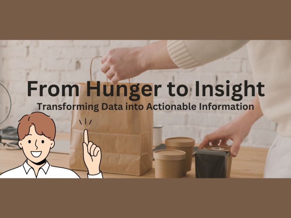
Analyzed over 2,000 rows of customer behavioral marketing data using Google Sheets to effectively evaluate campaign success levels.
🔗 Access the spreadsheet here.